NHL- Alexander Ovechkin

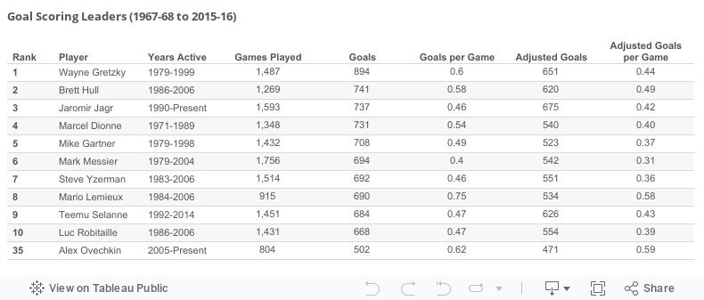
On January 10th 2016, Ovechkin became the 43rd player in NHL history to score 500 career goals. 

His goal scoring achievements are even more impressive when you consider the era he's playing in:

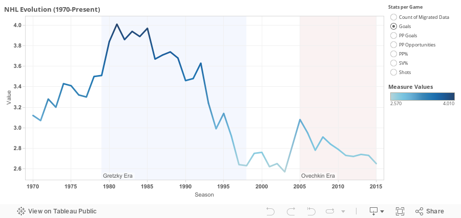
Ovechkin became the fourth youngest player ever to reach the 500-goal milestone despite playing in an era when teams average less than 3 goals a game. 

Although a decrease in power-play opportunities/goals has played a minor role, better goal-tending is the biggest reason for this recent goal drought. Save Percentage has increased from .873 in 1983-84 to .916 in 2015-16 and average shots per game has remained relatively constant. Running a regression analysis shows 94% of the variance in average goals per game can be explained by save percentage.

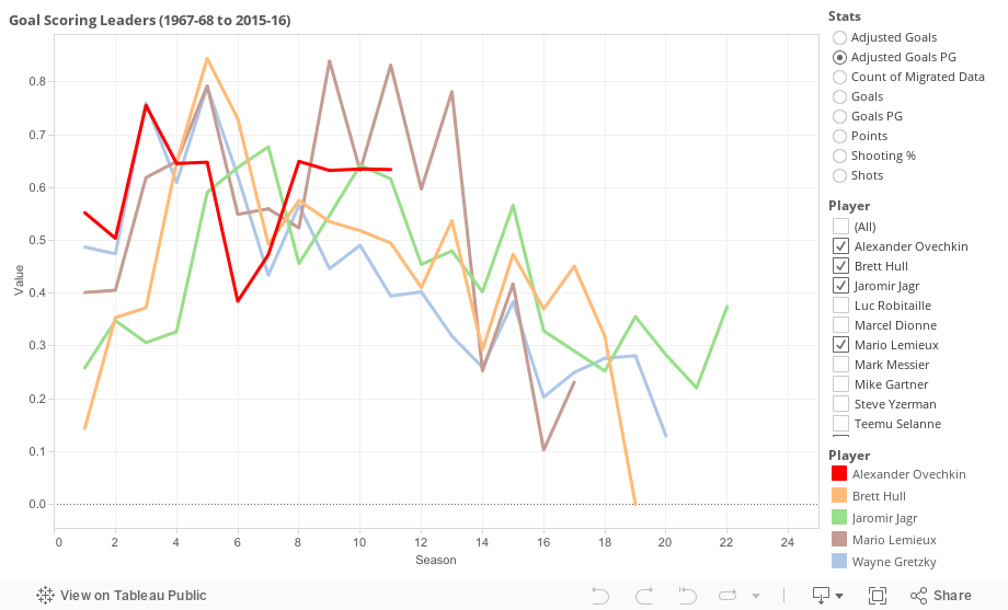
One way of comparing Ovechkin's goal-scoring stats with the all-time greats' is to calculate era-adjusted goals. I'll use Gretzky's rookie season as an example of how to calculate goal adjustments:

In the 1979-80 season, teams averaged 3.51 goals per game and  Gretzky scored a total of 51 goals. To adjust his goal total to this 2015-2016 season, divide the present-day goals per game average of 2.65 by the 1979-80 season average of 3.51, and then multiply it by Gretzky's 51 goals. In this case, Gretzky's era-adjusted goal total is 39.

Here's how Ovechkin stacks up against the all-time greats:


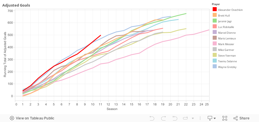
In his 11th season, he's on pace to finish with the most career era-adjusted goals:


Dashboard- Player Comparison by Season:

Gretzky's point totals are incredible- easy to see why he's "The Great One". 

Data Source:
www.hockey-reference.com

NFL- 2015 Free Agent Signings

How did the big spenders in free agency perform in the 2015 season?

"Free Agent Spending"= Total Contract Value/ Total Years
"Win Differential"= 2015 Wins-2014 Wins


Were teams who focused on re-signing players, rather than signing new players, more successful?

Sources:
SB Nation (http://www.sbnation.com/nfl/2015/3/10/8150357/nfl-free-agent-signings-tracker-2015-rumors)
www.Spotrac.com
 

NFL- Emergency Quarterbacks

This season has been particularly rough for starting quarterbacks. Seems like every couple weeks, a high-profile QB gets injured- Tony Romo, Ben Roethlisberger, Joe Flacco... list goes on and on. 

These injuries, coupled with the new trend of only having 2 active QBs on gamedays got me thinking- What are the chances that all the active QBs on a team get injured in a game and a team is forced to play an out-of-position player at quarterback? 

To answer this question, I first looked at week 15 rosters and inactives to determine which teams actually only dress 2 QBs on gamedays. Out of the 32 teams, 13 have 2 quarterbacks on their roster and 19 have 3. Interestingly, every single team only had 2 active QBs week 15 except for the Carolina Panthers (Joe Webb, their 3rd string QB, is mostly used on special teams). 

I was surprisingly unable to find any sort of data on past NFL injuries, so I had to do some research myself and find out how many QBs have been knocked out of games.

According to my findings, through the first 16 weeks, the following QBs left during a game and didn't return due to injury:
Week 1- Derek Carr, Josh McCown
Week 2- Jay Cutler, Tony Romo
Week 3- Ben Roethlisberger
Week 6- Marcus Mariota, Michael Vick
Week 7- Josh McCown
Week 8- Ryan Fitzpatrick, Josh McCown
Week 9- Teddy Bridgewater, Ben Roethlisberger
Week 10- Sam Bradford, Brian Hoyer, Landry Jones
Week 12- Josh McCown, Ben Roethlisberger, Tony Romo
Week 13- Matt Hasselbeck
Week 14- Andy Dalton, Brian Hoyer
Week 15- Marcus Mariota, T.J. Yates
Week 16- Matt Hasselbeck

That's a total of 24 QB injuries. Although some QBs are more injury prone than others (Josh McCown has left a game injured 4 times), for the purpose of this exercise, I'll assume all QBs have equal probability of getting injured.

Since there has been 24 injuries in 240 games, there is a 5% chance that a team's starting QB gets injured each game. The back-up QB who replaces the starter would have a 2.5% chance of getting injured that same game assuming that the starter, on average, gets injured halfway through the game. 

Based on these numbers, the chances of a team having 2 QBs injured in a single game is only 0.125%, or 1 out of 800 games (5% * 2.5%). It is very unlikely to see an emergency QB play in any given game.

That being said, if the trend of having only 2 active QBs on gamedays continues, we will most certainly see an out-of-position player forced to finish a game at QB in the very near future.

At 0.125%, we are likely to witness an emergency QB finish a game every 400 NFL games (800 / 2), assuming every team only dresses 2 QBs on gamedays. There are 256 total games in a regular season, so each season, there is a 64% chance a team will be forced to play an out-of-position player at quarterback.

As much as I hate injuries in the NFL, I am looking forward to the day when an unprepared wide receiver or cornerback gets the midgame nod from the coach to play quarterback for the team.

Data Source:
www.ourlads.com
www.nfl.com
www.fftoday.com

NFL- Positional Spending

Can we anticipate how well a NFL team will perform based on how they allocate their salary cap money?

This is the question I'll attempt to answer using 2014 team stats and cap figures. All salary cap figures are from the start of the 2014 season and don't take into account mid-season transactions.

First off, I'll take a look at whether there is an optimal way of allocating salary cap money between positions. 

Below are 2 charts that break down positional spending by team. The teams are sorted by total number of wins in the first chart.

Filter by clicking on a position on the far right, and selecting "Keep Only" or "Exclude". Click on team name to view sum of salary cap value.

Quick Observations:
- Although the Cowboys had the third lowest overall spending (behind the Jets and Raiders), they finished the 2014 season tied with league best 12 wins.
- The Seahawks also finished with 12 wins despite spending only about $18M on offensive skill positions (QB, RB, WR). Only the Browns spent less on those positions.
- The Dolphins had the largest total payroll at $129M, significantly more than the $113M league average, but finished with only 8 wins. 

Overall, it doesn't seem like there is much of a relationship between a team's total spending/salary cap allocation and number of wins, other than a couple small differences: 
          1. 10+ win teams tend to spend more on DBs ($22M vs $17M)
          2. Teams with 6 wins or less tend to spend less on LBs ($12M vs $17M)
That being said, there isn't an optimal way to divvy up salary cap money and many different approaches can be taken to build a successful team.  

Below is a dashboard I created. The relationship between positional spending and various team stats can be analyzed by selecting different criteria.

EXP stands for Expected Points. It's an advanced metric that indicates how well an Offence or Defense performs. Here's a great article which explains how it is calculated.

Quick Observations:
-Although there is some sort of correlation between defensive spending and Defense EXP (0.19 r-squared), there is none at all between offensive spending and Offence EXP (0.02 r-squared)  
-There seems to be little to no correlation between positional spending and most of these stats. This dashboard should be used as more of a tool to determine which teams have over-performed or under-performed based on salary cap spending. For example, assessing the relationship between QB spending and Passing Yards (r-squared 0.36), it can be determined that the Eagles and the Colts over-performed in that department, whereas the Rams could have expected more passing yards based on their QB spending.


Data Sources:
www.overthecap.com
www.pro-football-reference.com

NFL- Running Back Usage vs Salary

Nowadays, running backs appear to be interchangeable. Recently it feels like whenever a star running back goes down, the fill-in RB performs just as well as the starter. This has been a common occurrence this season: Charcandrick West / Spencer Ware for Jamaal Charles, Jeremy Langford for Matt Forte, Thomas Rawls for Marshawn Lynch just to name a few. 

Witnessing all these 2nd string running backs run wild inspired me to look into the relationship between RB usage and their salaries during the 2014 season.

To measure "RB usage", there are 2 stats I will primarily be using:
- Offensive Usage: Rushing Attempts + Receiving Targets per Game
- Offensive Snaps per Game

I used their salary cap value to measure salary and filtered out players who played 0 games or had less than 10 attempts/targets from the data.

First off, I was interested comparing salary and usage based on team rank i.e. How often does the highest paid RB on a team also have the highest RB usage rate? What about the second highest paid RB on a team? etc...

Click and drag for player count. Annotations represent avg salary. Avg salary for all RBs is $1.5M

For 18 out of the 32 teams (56%), the highest paid RB also has the most RB attempts/targets per game.

Looking at the chart, you can quickly identify top over-performers and the under-performers based on salary cap value:
Top Overachievers: Brandon Oliver ($420,000), Andre Ellington ($521,000)
Top Underachievers: CJ Spiller ($5.9M), Maurice Jones-Drew ($2.5M)

Below is a graph which compares Offensive Usage to Salary:

DeMarco Murray was due for a pay raise! He averaged 28.5 attempts/targets per game, yet was paid only $1.6M. Despite his enormous workload, his salary cap value is equal to Bilal Powell's, who only averaged 3.2 attempts/targets per game.

This graph looks at Offensive Snaps per Game vs Salary:

Matt Forte was the epitome of a workhorse RB. He averaged 61 snaps per game, which is 12 more than DeMarco Murray's 49.

In the graph above I also added "Adjusted Snap %" to put it all in perspective (hover mouse over players for additional stats).
Adjusted Snap % = Avg. Offensive Snaps per game / Avg. Team Offensive Snaps per game

Matt Forte's Adjusted Snap Percentage was 92%; he was on the field for approximately 92% of all offensive plays for the Bears in games he played. For comparison, Jamaal Charles, who had the 5th highest Adjusted Snap % in 2014, was at 69%.

Data Sources:
www.sportingcharts.com
www.footballoutsiders.com
www.overthecap.com
www.footballdb.com

NHL- Advanced Stats

The NHL is one of the latest leagues to openly embrace advanced statistics. Earlier this year, NHL.com introduced their new "Enhanced Stats" feature to give hockey fans additional ways to analyze players' and teams'  performances.  

There are now so many metrics available in hockey to evaluate how good a team really is. But which of these stats is the best indicator of how many wins a team will have in a season? 

I will look at the following metrics:

Goals For Percentage (GF%): GF / (GF + GA)

Shots on Goal For Percentage (SF%): SF / (SF + SA)

Corsi For Percentage (CF%): CF / (CF + CA)
Corsi For = Shots on Goal + Missed Shots

Fenwick For Percentage (FF%): FF / (FF + FA)
Fenwick For = Shots on Goal + Missed Shots + Blocked Shot Attempts

Zone Start Percentage (ZS%): OZFO% / (OZFO% + DZFO%)
OZFO% = Percentage of faceoffs that take place in the offensive zone

PDO: Sh% + Sv% 

I will run regression analyses to determine which of these metrics best correlates with team wins.

Stats and team records from the 2014-2015 regular season will be used. All the stats will be for all situations, instead of 5v5 only. I will also disregard shootout wins and only use Regulation and Overtime Wins (ROW) in my analysis. 


Note: For all the stats above, NHL average is 50% except for PDO, which is 100.

R-Squared:
GF%- 0.92
SF%- 0.43
CF%- 0.33
FF%- 0.42
ZS%- 0.21
PDO- 0.58

Quick Observations:
-It's no surprise GF% has the highest correlation with season wins
-Interestingly, the more basic statistic SF% has a higher correlation with wins than CF% and FF%.
-PDO, which is often used to measure "puck luck", is a better predictor of wins than "puck possession stats" such as CF% and FF%. 


Data Source: www.puckalytics.com

NBA- Draft Picks

Every year, it seems like One & Done prospects dominate the buzz surrounding the NBA Draft. But do they perform better than their peers who spend multiple years in college or come from overseas? 

I will analyze players who have been drafted between 2007 and 2014 and look at their performance up until the end of the 2014 NBA season. To measure their performance in the NBA, I will use the advanced metric "Win Shares per 48 Minutes", which determines how much a player contributes to a given win. You can read more about this metric here and here.

First off, it is important to see where these One & Done prospects get drafted to be able to compare them to their peers who were drafted in similar positions. The chart below is a breakdown:

From 2007-2014, 67, or 14% of all drafted players, have been One & Dones. As you can see from the chart above,  the majority of them get picked early in the draft. Sixteen One & Dones have been picked in the Top-3 and only 9 have been selected in the 2nd round.

Below is a chart which breaks down how they perform in the NBA using the WS/48 metric. From here on out, I excluded players who who have played less than 20 NBA games from my analysis since their WS/48 is often skewed due to small sample size.

Although One & Dones drafted in the Top-10 perform relatively well, if not better than their peers, those drafted past the 10th pick perform significantly worse than their peers both in their rookie seasons and careers.

It is interesting to see that some of the conventional wisdom about NBA draft prospects is indeed true when it comes to picks 11-60:
-One & Dones who aren't projected to be top picks are not be ready for NBA; they might have been better off staying in college for longer
-Prospects who have played multiple years of college basketball are more "NBA ready" as they outperform their peers in their rookie seasons
-International players do seem to need more time to adjust to NBA basketball. They outperform their peers in their careers despite sub-par performances their rookie seasons

Below is another chart which compares draft position to WS/48, where each point represents a player:

Assuming players with a career WS/48 below 0.0153 (standard deviation) are "draft busts", One & Dones would have an alarmingly rate of busts despite their favorable draft positions. 19% of all One & Dones end up becoming busts, where as it's 14% for 2+ years of college players and 12% for international players. 

If a player with a career WS/48 of above 0.1256 (standard deviation) is considered to be a successful draft pick, Top-3 draft picks who spent multiple years in college have a better "success rate" (43%) than One & Dones (25%). 

That being said, overall, One & Dones do have a higher ceiling. 23 players drafted between 2007-2014 have been selected to All-Star games. Of those 23, 9 are One & Dones (that's 39% of all All-Stars, despite only representing 14% of all draft picks), 13 are 2+ years of college players and 1 is an International player. 

Although WS/48 is an excellent way to measure performance, there are some caveats to using solely this statistic as a way to judge a NBA player's performance. Below are the top WS/48 players drafted between 2007 and 2014.

Although there are many familiar names on this chart who deserve to be mentioned as top NBA players, the shortcomings are obvious. For example, it's difficult to argue that there are 9 players drafted in this time who have performed better than reigning MVP Steph Curry, especially when you see names like Tiago Splitter and Brandan Wright ranked right above him.  

I also wanted to include the number of draft picks who are out of the league in my analysis, but unfortunately, based on the data available, it is impossible to identify which players are currently out of the NBA. 

That said, if I were a GM, based on this analysis, I would be cautious drafting One & Dones outside the Top 10.

Data Source: www.basketball-reference.com/

NFL- Fantasy Points Against

Which opponents should you target when drafting your NFL DraftKings team? 

I created a visualization that illustrates how many fantasy points per game each team allows for each position. 

The data can be filtered by position, positional depth chart, home/away and week.

Depth Chart- I created depth chart designations based on DraftKings salary. For example, Week 1 for Washington, DeSean Jackson ($6800), as the most expensive receiver, gets a WR1 designation, while Pierre Garcon ($5200) is a WR2. Week 2, Pierre Garcon ($5000) gets bumped up to a WR1 as the most expensive Redskins receiver since DeSean Jackson is out with injury.

You can pull useful insights filtering by depth chart, especially for the WR position. Looking for a sleeper? See which teams give up the most points to WR2s and WR3s. Want to spend big on a star receiver? See which teams give up the most points to top receivers.  

Data Source: RotoGuru, Weeks 1-9